


Content Management System Redesign
Software Engineering of America
Expertise: Enterprise Design, Usability Study, Design System
The TRMS Web application is a content management tool for the company’s customers to be able to search for large reports by filtering via data attributes and transform attributes of the reports and convert them into other platforms.
Team:
1 Product Designer (me)
1 Project Manager
2 Engineers
MY ROLE
I was the sole lead product designer with the task of creating the detailed wireframes, mockups, high-fidelity prototypes and developing the design system for the Web application.
THE CHALLENGE
The challenge was to redesign the existing application in order to meet customer expectations in terms of how effective it was to allow customers to perform their primary tasks of filtering, searching and transforming reports derived from the mainframe.

The current design, shown below, was a mismatch with the user’s mental model. When searching for reports, users had to first select catalog, then individual attributes like date, recipient ID and cycle number. However, the way the fields were laid out caused confusion over what to do first and selecting more than one attributes was unclear since there was no affordance given to users. Also, the search results was separate from the search fields which meant users had to go back to perform another search if they needed other reports.
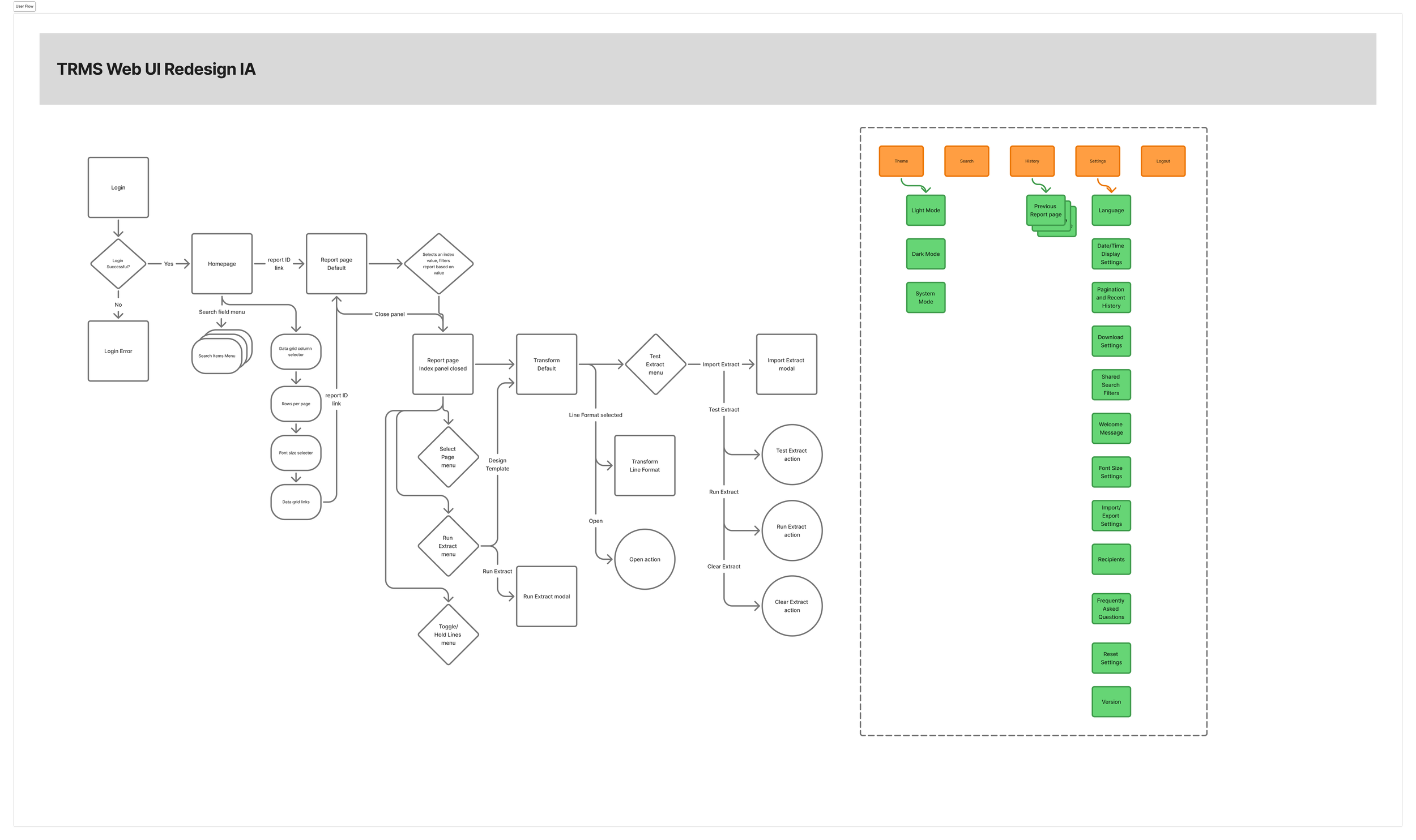
INFORMATION ARCHITECTURE
I created a information architecture for the newly redesigned TRMS Website. I organized it by hierarchy of parent-level and child-level pages. Also, I created a depth chart of the navigation menus and pages.

RESEARCH
I conducted multiple discovery sessions with the stakeholders to better understand the problem, review functionalities of the current Web application, conduct competitive analysis and provide designs to gather input and iterate on the designs. To validate the designs, I conducted a usability study on the prototype to understand user engagement and the ability of users to successfully accomplish their primary tasks.
Primary tasks associated with:
Search for a report using at least 2 attributes (e.g. Report ID, Cycle Number)
Find a specific report based on a set of search results
Change the settings for how users view search results
View an indexed report based on a specific index value
Convert a report to a version with defined values
DESIGN EXPLORATIONS
During the ideation phase, we considered some alternate designs. Here are a few design ideas we explored.
The variation for the homepage allowed users to get answers to FAQs, watch video tutorials for some common functionalities and user’s recent activity.
This variation shows the results panel separate from the search panel. We decided at the end to include the search and results panels on the same page based on customer’s use case of searching frequently.
Side by side view of search and results panels.
FINAL DESIGNS
The usability study findings really helped to inform the designs. After synthesizing the findings, I found several design recommendations that I incorporated into the final designs.
1) Users wanted to easily have access to search functionality at any point throughout the experience, so I decided to have a stacked view of the search and data grid panels whereby they can easily search for more values if they couldn’t find their reports.
2) There were some confusion over how to add new search attributes. By including an Add and Delete button at end of each search fields, I provided affordance to users add and delete fields in context to their actions
3) Users really liked the ability to select indexes within the reports and toggle between report and index panel. We showed two versions where a) the indexed panel appears as a modal window after searching and then the results are displayed and b) the indexed panel is a flyout menu that is activated by default when the Report page is opened and can be closed and reopened on the Reports page


