Bank of America Windows Mobile App Toolkit
Bank of America
Expertise: UI Design | Styleguide Specifications | Design Systems
At Bank of America, I worked on the design toolkit for the Windows consumer mobile app. I created the design specs for all features within the app.
MY ROLE
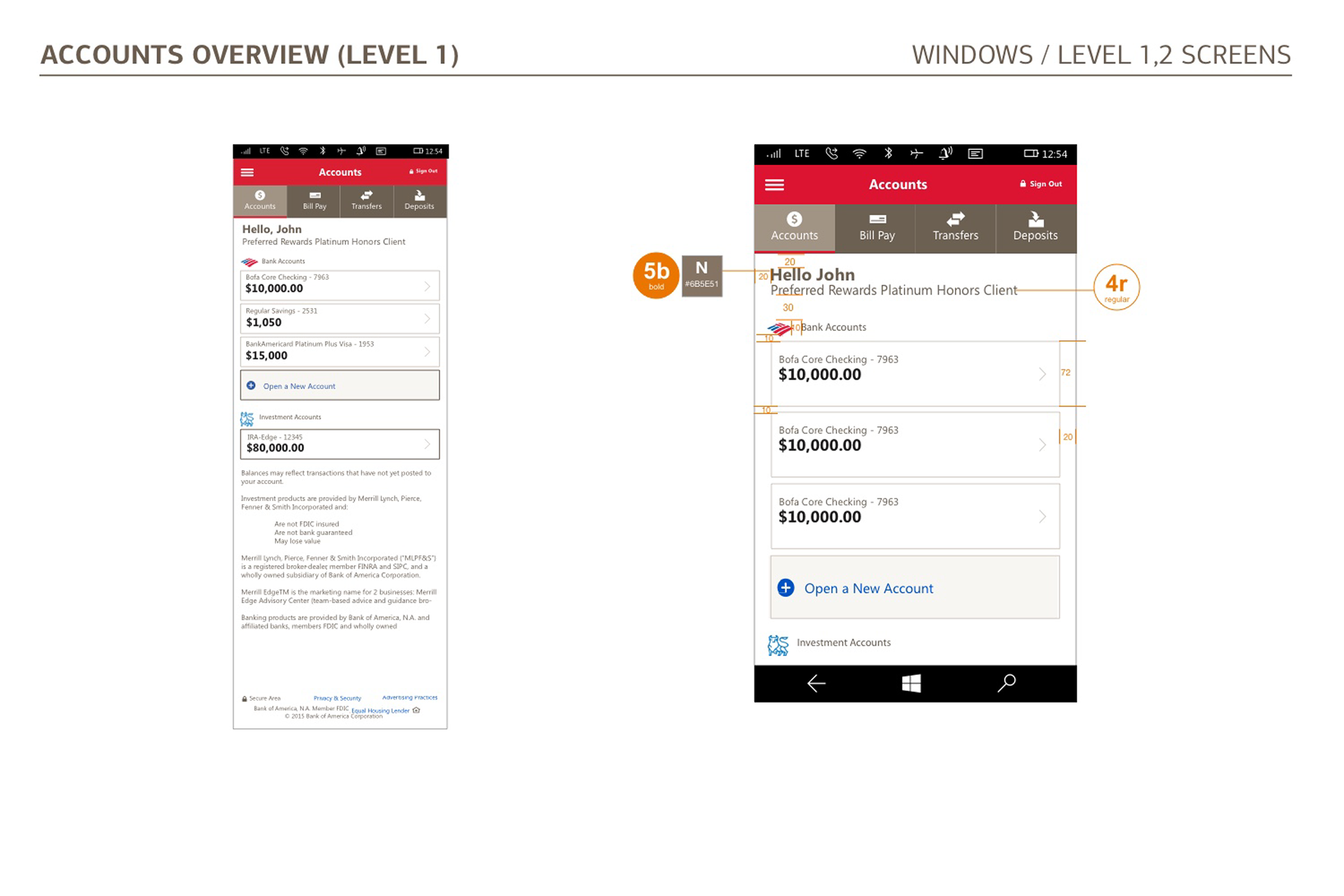
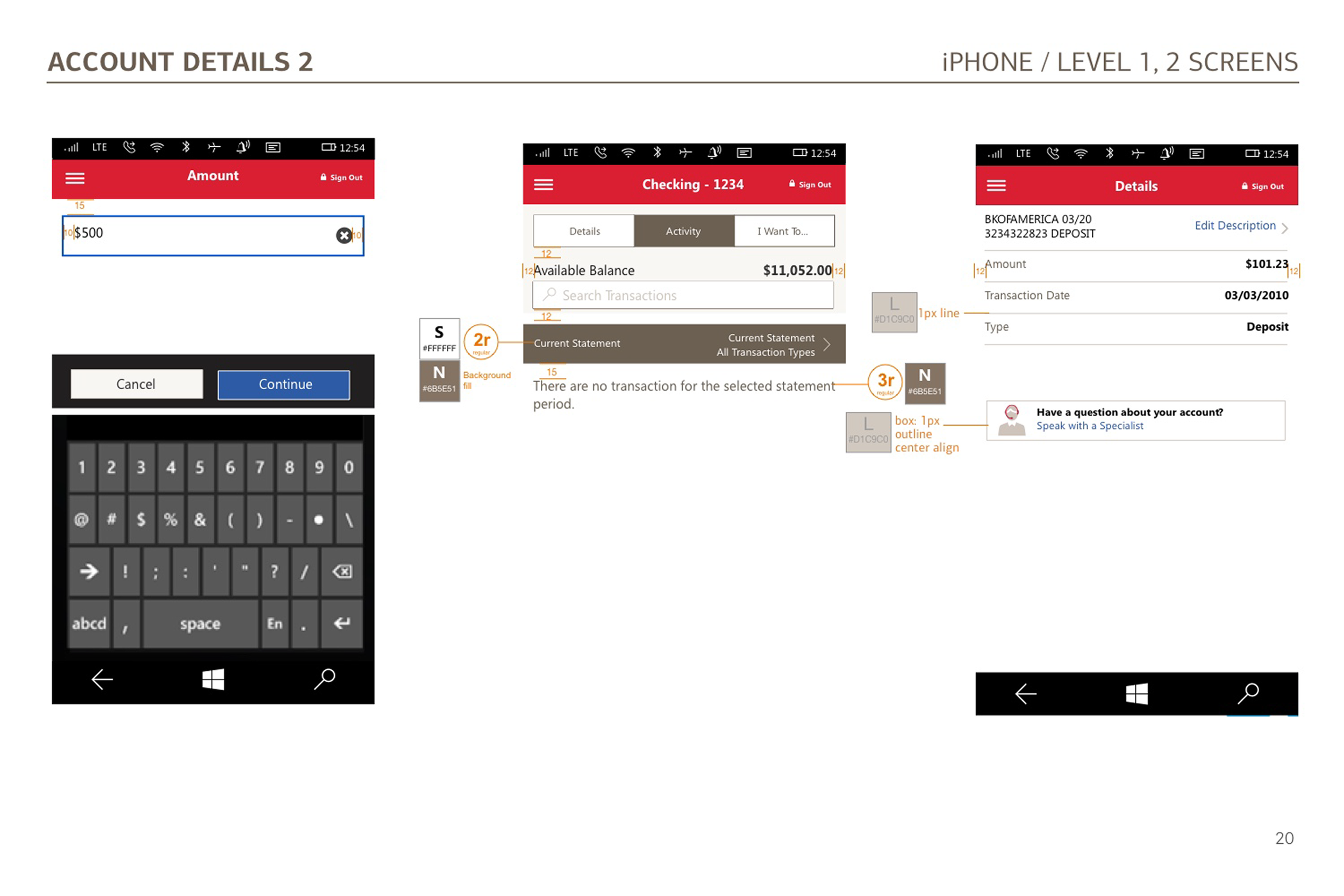
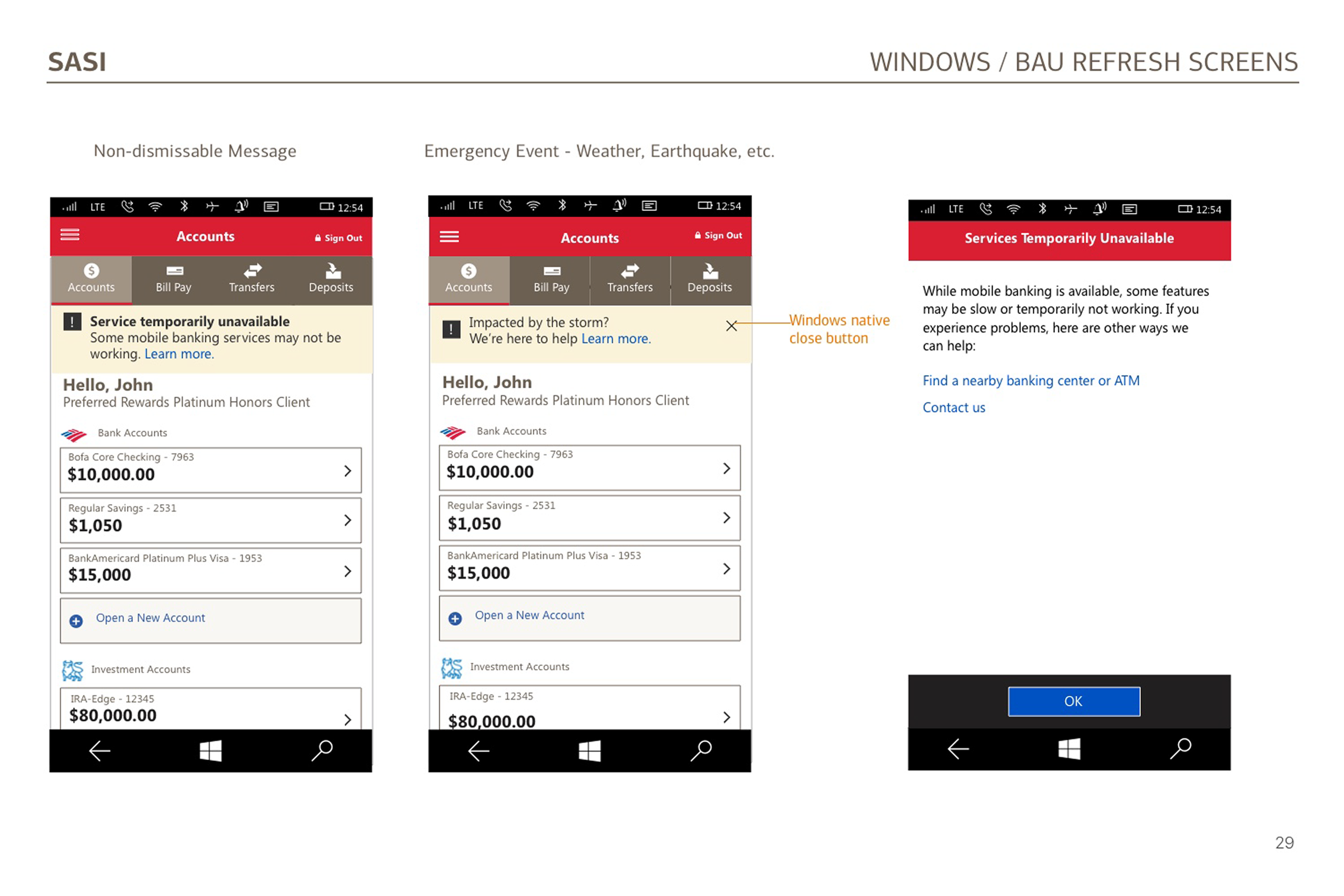
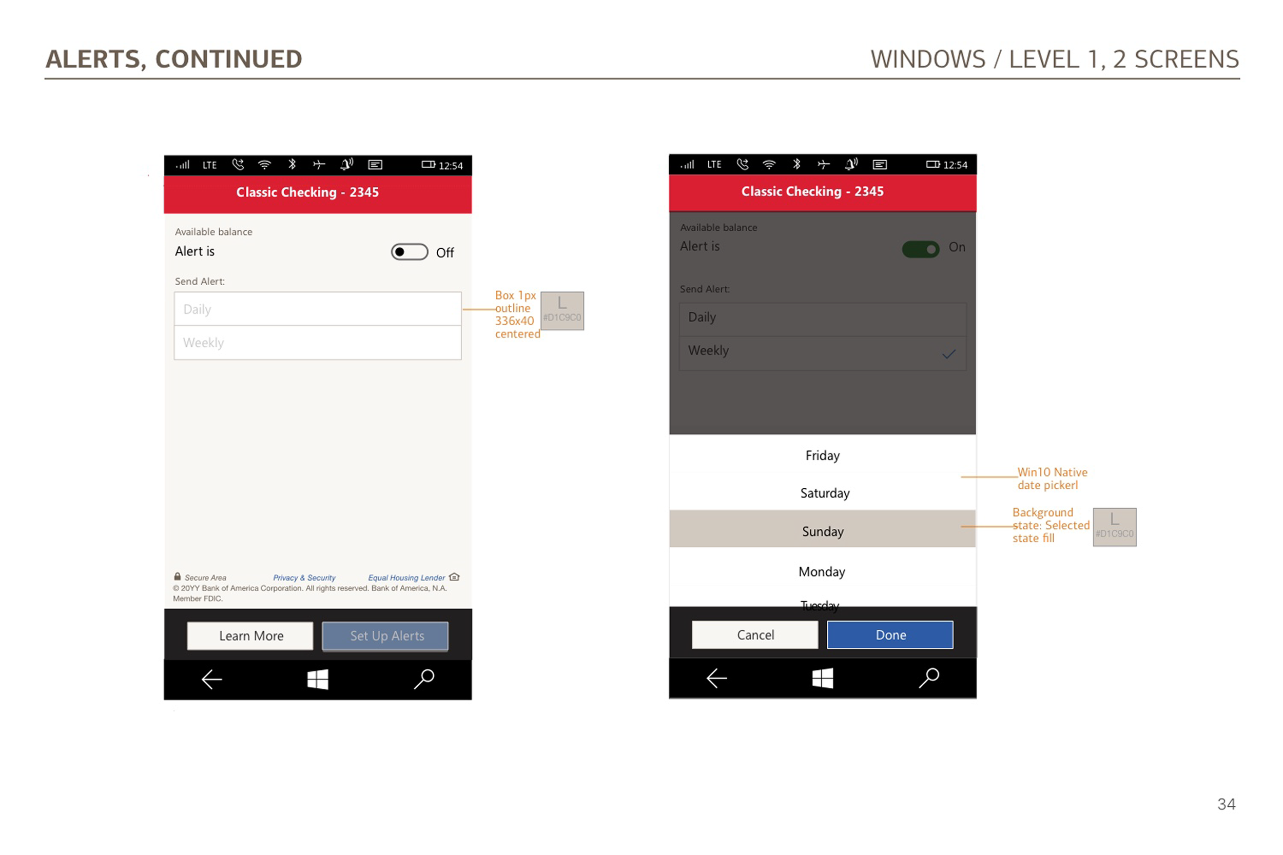
My role was a visual designer for this project with the task of developing the toolkit by researching Microsoft’s Fluent design system and utilizing some of their components in building the toolkit for Bank of America’s Windows responsive handset and tablet devices. Everything from typography to specific components (e.g. headers, tables, buttons, etc.) were based on the Windows design system with some modifications to meet Bank of America’s branding and style themes.
THE CHALLENGE
I spoke with the visual design team to understand their familiarity with Windows devices and Microsoft’s Fluent Design System. We didn’t have an established design toolkit specifications document for the Windows devices. Therefore, I researched the Windows design system extensively to get up to speed on its styling and theme for their components, color palette and typography.
APPROACH
By analyzing the Windows design system, I learned that Windows:
Uses Segoe UI font family
Uses sharp edges to buttons and other components, a more “boxier” look and feel than Apple’s Human Interface Guidelines.
Doesn’t have depth to components like buttons and other action items compared to Google Material Design.
Then, I developed the design toolkit for the Windows app. Here are the design specifications for all of the features on the mobile app.